Showing posts with label #colorinspiration. Show all posts

Sunday, April 2, 2017

Holey Moley


A Nuno Felt collarwith the color inspiration hanging behind it

Wednesday, January 6, 2016

Artful Color for Creative Projects


Artful Color for Creative Projects: from eBook to Print. Here is the cover spread (front, back and spine) for a one-off hardcopy to check color and layout.

I self published Artful Color as an eBook in May 2013 and am nearing my sales goal of 1000 copies! WooHoo!!

When I hit my mark, I'll publish a hard copy (thank you to all who have asked for it!)
Don't have the eBook yet? You can read more about it on my website: http://www.beverlyashgilbert.com/books/artfulcolorforcreativeprojects.html

Monday, June 1, 2015

Color Inspiration


Color Inspiration - Blue Lupin
From Be Inspired

Monday, April 13, 2015

Color Inspiration - Colorful Street


... and as a color palette

From Be Inspired

Friday, April 3, 2015

Things I Love


Things I Love
From Be Inspired

Wednesday, March 25, 2015

Color Inspiration - Orange Ball Gowns


This splash of color caught my eye as I was racing to my car on a rainy day

From my Gallery of Color Inspiration

Monday, March 16, 2015

Color Inspiration


Color Inspiration - Collection of Glasses

Be Inspired

Wednesday, February 25, 2015

Color Inspiration


Color Inspiration - Orange Seaweed
From Be Inspired

Wednesday, January 7, 2015

Color Inspiration


Color Inspiration from Purple Flower Garden
Interestingly, the color palette I used in my last painting actually includes the #ColoroftheYear: Marsala!

Would love to see what you do with this color palette!

Tuesday, December 16, 2014

How to Use the Colors of the Year


Tangerine Tango? Radiant Orchid? Marsala?
(here are the #1 colors of the last 3 years used together)
#ColoroftheYear


Colors come and colors go - the color industry declaring what is hot right now and the fashion, home decor, beauty product industries scrambling to keep up by issuing new clothing, new jewelry, new paint, new pillows and towels, nail polish... This is of course designed to keep us buying!

But how do we keep up? What if we really love the colors from 2 years ago? What if our wardrobe is filled with last years 'Radiant Orchid' (2013), our dining room painted with a bright red wall from oh sometime in the early 2000s, our living room brightened up with accents of 'Tangerine Tango' (2012). How does the new 'Marsala' (2015) fit in?

My #1 Mantra: Define your color palette, the one that makes you feel happy, comfortable, energized, the colors that make you light up from within. Surround yourself with 'Your Colors', stick with them whether they are 'in' or not. Then - only after you feel good - for a bit of fun, throw in accents of the Color du Jour.

But, you ask, what if the Color of the Year doesn't go with my color palette?

This is the fun part!

My #2 Mantra: All colors (can) go together! Yup - even if they are very far apart and look off when viewed side by side by their selves. The key is what you put with them!

I go into a lot more depth in my eBooks: Artful Color for Creative Projects and Dip Into ColorDip Into Color - but here is the heart of pulling colors together - add transition colors, the ones that guide your eye from one color to the next and voila! they all look good together!

Have fun pulling colors together and adding accents of the Color of the Year to your palette!


Thursday, December 4, 2014

Color Inspiration - Barberry New Growth


Pantone's 2015 Color of the Year - Marsala graces this cool earthone color palette
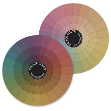
Color wheel from Eye For Color

Color Inspiration - Mustard Plant


Color Inspiration with 2015 Color of the Year - Marsala (4th from left)

This little Mustard plant self seeded itself next to some bright green Euphorbia in my garden last spring.

Color of the Year - Marsala


Looking at how Pantone's new color of the year works into a Purple and Gold color palette!


Color palette from a few days ago - with added 'Marsala'

Saturday, June 28, 2014

Color Inspiration - Pink Climbing Rose


This heavenly scented climbing rose has such delicate shades of green and blush - Nature yet again giving us a lovely complementary palette

Artful Color for Creative Projects

Wednesday, June 18, 2014

Color Inspiration - Soft Pink Rose


 Another rose from our new garden - the name? "Beverly"

So of course we had to find a spot for it! Bonus, it has the most intense, sweet smell (winning awards for it's scent)

Using a 100mm fixed focus lens, stopped down to f/4, enabled me to blur the background into a symphony of sorbet colors and a yummy pastel color palette

Pastel color wheel in Eye For Color

Monday, June 16, 2014

Color Inspiration - Lavender and Thyme


Lavender and Thyme are spilling over our garden paths releasing their heady fragrance as we brush against them!

A lovely Split Complementary color combo for you to play with

For more color palettes: Artful Color for Creative Projects

Tuesday, May 6, 2014

Color Inspiration - Scratched Paint

 (color palette in various mediums)


Artwork created for fabric sublimation provided color inspiration for other projects

Wednesday, March 19, 2014

Color Inspiration - Garden Tools


Color is everywhere, but sometimes so subtle we don't realize that our eyes are picking up nuances of color in every day objects.

This simple tool bench vignette provides a soft, cool earthy palette which would be stunning in a room (imagine soft grey-blue walls, taupe furniture, a chocolate rug and a splash of terracotta in a pillow or painting), or in an elegant piece of jewelry (smoky quartz, carnelian and kyanite) or...

For more color inspiration

Wednesday, March 12, 2014

Color Inspiration - Pink Chairs in Holland


Feeling Pink - Shop in Holland in all shades of pink!

See what I have created with this palette in Artful Color for Creative Projects