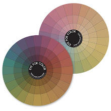
 This is part 2 of my color discussions/exercises. Come dive into color with me!
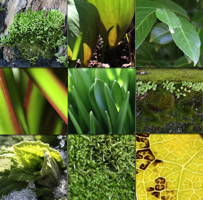
Monochromatic color schemes come alive by including different values, from bright highlights to dark shadows. There is movement in this green mosaic because green flows from yellow-green to deep green to even a bit of blue-green where the sky is reflected in the laurel leaves. Monochromatic doesn't have to mean a solid, single shade of a color (how boring!) - so much more exciting to expand it!
How many of you tried the monochromatic collage exercise from the last post? Lisa found herself questioning whether her 'reds' were 'red' enough and I say anything with a bit of reddish tinge to it is fair game! So,
yes to pink and red-orange and violet-red and burgundy! I hope you made a few and tried lots of different colors. Ready to add another color?
This next exercise will help you move from one color to another by taking advantage of the variations within each monochromatic collage. To give you an idea of where we are going to go with this, I put together this mosaic to show how red and green (complementary colors!) can work well together. An effective tool to pull your eye from one color to another is to use
transition pieces.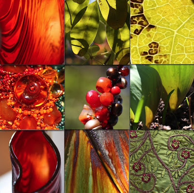
There are many different types of transitions (much more of this at a later date) but the most common type of transition from one color to another is to find pieces that include bits of each color. Note that almost all of the photographs contain both green and red (in some shade) and so your eye naturally flows from red to green.
On to the next exercise (make sure you do
Exercise 1 first!):
Color Transitions - Exercise 2
Materials:
- old magazines that you can tear up
- glue stick
- sheet of paper (cardstock preferably) cut into a square
Directions:
- Choose 2 colors - easiest if they are of similar saturation (purity, intensity)
- Tear out pieces of each color from the magazine
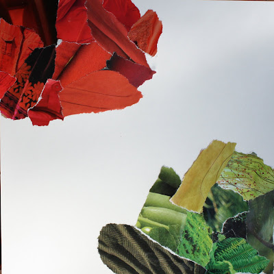
- Glue 'blob' of one color into one corner and 'blob' of second color into opposite corner as shown above
Now comes the fun part:
- The challenge is to flow between the 2 original colors
- Flip through your magazines to try to find pieces that contain both colors OR introduce an additional color between the 2 originals such that you can find transition pieces between each set of colors.
- Try 'leaning' the colors of your original piles towards the next color

For instance, in the example above, I found some calla lilies that moved gradually from a muddied green (green that has a bit of it's complementary color - red - in it) to orange. I also found lots of pieces that moved from green to yellow and yellow to orange. Moving from red to orange was easy - there were some orange-red bits in my original pile of red.
Try moving through a completely different color on the other side. In this case I found a fabulous green to pink petal with a green bug (lace wing?) so I went with hot pink! The deep rich pink flowed beautifully back into reds which leaned to the cool (red with a touch of blue in it) on that side.

The center can be a bit tricky and it is okay to leave it open. However, in this case I found a handblown glass vase in yellow-green with an orange flower on top and it worked as a centerpiece.
These colors can be echoed in any medium. I bought some fun fabrics in all of the colors of my collage and even found transition pieces that tied 2 colors together.

This
Analogous bead soup flows from pink through red into orange (so yes, Lisa you can use them together!).

Trying out color schemes with old magazines and glue is a cheap, easy, fun and forgiving way to play with color. Use the colors you pulled together in your collage for some fun new projects!