'Vietnamese Boats' - unknown
Saturation is the purity, intensity, brightness of a color. Saturated colors feel alive and I am drawn to them. This oil painting by an unknown Vietnamese artist hangs in my deep gold living room and draws me into the saturated blues of water and evening sky. The dilapidated buildings pulse with intense yellows and a bit of orange-red.
The same color palette is used below - but what a difference! The muted colors in Susan Reynold Leonardt's drawing are echoed in the bouquet of flowers, the tea cup and even the shortbread biscuit. This
unsaturated palette is peaceful and serene in comparison to the vibrancy of the oil painting. (By the way, Susan is my neighbor and very good friend who agreed to draw this and other pictures for the Inspirations spread in
EYE FOR COLOR.)
 Vignette from Eye For Color - drawing by Susan Reynold Leonhardt
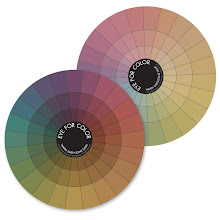
Saturation is a powerful tool in your composition. To understand it more fully, take a look at the color wheels below. These saturated and pastel color wheels are from
EYE FOR COLOR.
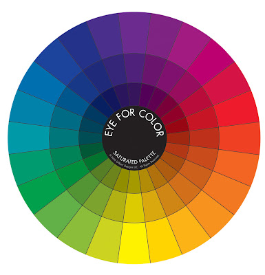
The outer ring of the Saturated Wheel is the most intense version of each of the 24 color families. The deep, rich, earthy tones of the inner rings are less saturated because each pure color of the outer ring has been diluted (with either black or it's complementary color - more on that another time). Note that as you move into the center of the saturated wheel, the colors become less
saturated (less pure)
and lower in
value (darker).
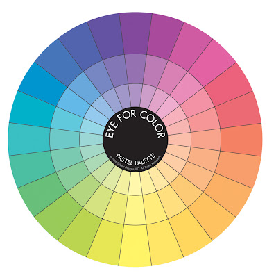
The outer ring in the Pastel Wheel depicts the same color families as in the Saturated Wheel, but white has been added - reducing the saturation (less pure) and increasing the value (lighter). As you move into the center of the wheel, the colors become even less saturated and higher in value. These unsaturated colors are peaceful and serene in comparison to the vibrancy of a saturated palette.
Have you noticed how beautifully the colors with similar saturation blend together? To see this more clearly, my girlfriend,
Joie (what could I do without you?!) has isolated colors within each ring of the color wheels. These pastel colors bring to mind iced sorbet ...
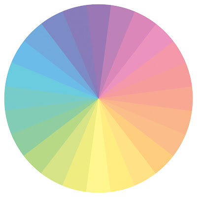 Middle ring of the EFC pastel color wheel
These low value (dark) unsaturated colors are earthy and complex and look very rich together, a true 'autumn' palette (remember
Color Me Beautiful ? - see side bar):
 Inner ring of the EFC saturated wheel
As you can see, colors of similar saturation look yummy together and provide another
transitional element (
remember from last time we chose transitions which contained bits of each color) to help pull your eye from one color to another. Sometimes large differences in saturation or value is exactly what you want to make specific elements in your design stand out. But if the colors in your composition seem to compete with each other and appear speckled, then you may need to transition between each using
saturation as a bridge. Take the following pile of gems for example.
Light yellow-green (low saturation and high value) and deep violet-red (high saturation and low value) are 2 parts of a triad (we will discuss this another day) and work well together. However, the combination on the left is a little speckled because of the large differences in value and saturation.
Adding gems within the same 2 color families, but this time with comparable saturation, helps pull the 2 original colors together. The composition on the right isn't necessarily better than the first, it is just a little more harmonious because the colors flow (or
transition) from one to the next.
This leads us to...
Focus on Saturation - Exercise 3
(I recommend doing:
Exercise 1 - The Value of Texture and
Exercise 2 - Color Transitions first!)
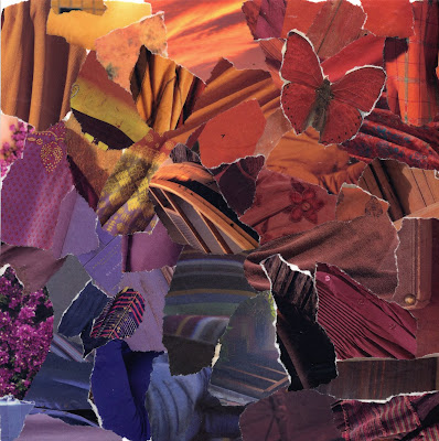
Materials:
- old magazines that you can tear up
- glue stick
- sheet of paper (cardstock preferably) cut into a square
Directions:
- Choose 2 colors - this time make sure to use highly saturated colors (pure, intense)
- Tear out pieces of each color from the magazine
- Glue 'blob' of one color into one corner and 'blob' of second color into opposite corner as you did in the previous exercise.
Move from one color to the other:
- The challenge is to flow between the 2 original colors and avoid a 'speckled' appearance
- Flip through your magazines to try to find pieces of equal saturation
- Try 'leaning' the colors of your original piles towards the next color by matching value (darkness or lightness)
- Check how well you transition by squinting your eyes and looking at your composition. In this manner you cut down the light entering the cones in your eyes which reduces your ability to see color and allows you to focus on light and dark (the function of the rods in your eyes)
- See the collage above for inspiration
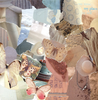
Now do the same thing with unsaturated colors. In the example below I chose high value pastel hues. I actually didn't do a very good job of transitioning without 'speckles'. Squint your eyes and you will notice a few pieces out of place from a value standpoint. However, I really liked the composition and decided to leave it as is... oh well! (I could tell you I did it on purpose to illustrate a point...)
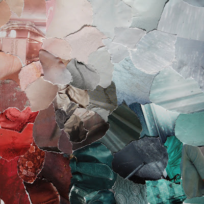
Finally - the ultimate challenge is to flow between 1 highly saturated color and an unsaturated color. I also suggest using ones far apart in value. Take a look at the piece below to see what I mean (the little dark dots are rain - I had to race outside to grab as much light as possible on this overcast day in Seattle and got the pic just before the clouds burst!).
I would love to see your compositions with paper. Thanks to those of you who have already shared your results from the previous exercises with me and on your own blogs! I would also love to see you do these same projects in your favorite mediums - photography, painting, beadwork... Let me know what you come up with!
Even though I'm a saturated kind-of gal, I was in the mood for the muted pastels of spring. Here is bouquet of stock in my kitchen.

My 8 year old son told me the violet-pink ones smell like cinnamon. Unfortunately I'm on week 7 (yes 7!!) of a nasty cold/flu bug and my nose is too stuffy to smell them...

 'Hot Pear' - torn paper collage

 'Little House in the Hills' - torn paper collage
 'Sunflower' - torn paper collage
 'Red Apple' - torn paper collage
 'Mardi Gras Lamp' - torn paper collage
 'Tree on the Hill' - Morgan Gilbert