

This is part 2 of my color discussions/exercises. Come dive into color with me!
Monochromatic color schemes come alive by including different values, from bright highlights to dark shadows. There is movement in this green mosaic because green flows from yellow-green to deep green to even a bit of blue-green where the sky is reflected in the laurel leaves. Monochromatic doesn't have to mean a solid, single shade of a color (how boring!) - so much more exciting to expand it!
How many of you tried the monochromatic collage exercise from the last post? Lisa found herself questioning whether her 'reds' were 'red' enough and I say anything with a bit of reddish tinge to it is fair game! So, yes to pink and red-orange and violet-red and burgundy! I hope you made a few and tried lots of different colors. Ready to add another color?
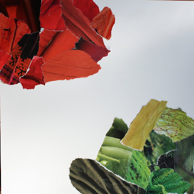
This next exercise will help you move from one color to another by taking advantage of the variations within each monochromatic collage. To give you an idea of where we are going to go with this, I put together this mosaic to show how red and green (complementary colors!) can work well together. An effective tool to pull your eye from one color to another is to use transition pieces.

There are many different types of transitions (much more of this at a later date) but the most common type of transition from one color to another is to find pieces that include bits of each color. Note that almost all of the photographs contain both green and red (in some shade) and so your eye naturally flows from red to green.
On to the next exercise (make sure you do Exercise 1 first!):
On to the next exercise (make sure you do Exercise 1 first!):
Color Transitions - Exercise 2

Materials:
- old magazines that you can tear up
- glue stick
- sheet of paper (cardstock preferably) cut into a square
Directions:
- Choose 2 colors - easiest if they are of similar saturation (purity, intensity)
- Tear out pieces of each color from the magazine
- Glue 'blob' of one color into one corner and 'blob' of second color into opposite corner as shown above
Now comes the fun part:
- The challenge is to flow between the 2 original colors
- Flip through your magazines to try to find pieces that contain both colors OR introduce an additional color between the 2 originals such that you can find transition pieces between each set of colors.
- Try 'leaning' the colors of your original piles towards the next color

For instance, in the example above, I found some calla lilies that moved gradually from a muddied green (green that has a bit of it's complementary color - red - in it) to orange. I also found lots of pieces that moved from green to yellow and yellow to orange. Moving from red to orange was easy - there were some orange-red bits in my original pile of red.
Try moving through a completely different color on the other side. In this case I found a fabulous green to pink petal with a green bug (lace wing?) so I went with hot pink! The deep rich pink flowed beautifully back into reds which leaned to the cool (red with a touch of blue in it) on that side.

The center can be a bit tricky and it is okay to leave it open. However, in this case I found a handblown glass vase in yellow-green with an orange flower on top and it worked as a centerpiece.
These colors can be echoed in any medium. I bought some fun fabrics in all of the colors of my collage and even found transition pieces that tied 2 colors together.
These colors can be echoed in any medium. I bought some fun fabrics in all of the colors of my collage and even found transition pieces that tied 2 colors together.

This Analogous bead soup flows from pink through red into orange (so yes, Lisa you can use them together!).

Trying out color schemes with old magazines and glue is a cheap, easy, fun and forgiving way to play with color. Use the colors you pulled together in your collage for some fun new projects!


Fun exercises. We can always use more color explorations.
ReplyDeleteThat colour montage looks pretty good I'm going to give this a try
ReplyDeleteLovely colour montage,
ReplyDeletehave a look at Tricia's blog find on my links.
were dooing a colour Challenge for TricaisTextileChallenge group,
Have a great weekend
Jean
Hi Beverly, thank you for visiting and leaving your lovely comment! This is a very interesting post and exercise, I love colors and have always been drawn to those combinations that are complementary. I ones designed the color scheme of a website using blue and orange and it worked amazingly well! Take care, Kerstin
ReplyDeleteI have always responded to colour so instinctively and it's really interesting to see the theory (and practice of using it) so beautifully explained. I am definitely going to have a go at this torn paper collage exercise when I have some time to play! You are inspiring me to explore colour more consciously!!
ReplyDeleteBeverly! That pic of all the batiks is making me want to go buy some! I am a batik fanatic and collect as much of it as I can for my quilts. I love your colorways and hope to learn something from your blog.
ReplyDeleteWoww... great post and wonderful blog!... simply adorable! Thanks for adding a link to my blog!... I'm going to link your too!!!
ReplyDeleteWhat great, easy to follow color exercises. I can't wait to put them into play and see what happens!
ReplyDeleteBeautiful post, Beverly. I am always looking for ways to use color to greater effect in my felting. I just listed your blog on mine as one to follow.
ReplyDeleteThank you,
Arlene
just thank you...
ReplyDeletemona & the girls
I found your blog by accident - serendipity, really. I've already told my mom to come check it out (and subscribed myself). I think I'm going to love watching you work with color - and trying some, too! While I don't bead, I think these exercises will help immensely with what I do (mostly stamp & make cards). What an amazing link that lead me here!
ReplyDelete