Tuesday, March 31, 2009

While writing my book...

I am being pulled away for a few days to partake of masses doses of creativity, female bonding and gorgeous scenery at Artfest outside of Port Townsend! Kelly Rae Roberts alerted me to a sudden opening vacated by one of her dear friends and made the festival sound so alluring that I had to do it! I will stay with Kelly Rae and her mommy in one of the officers quarters in the middle of Fort Warden.

LinkLight House at Fort Warden

Fort Warden is one of my family's favorite camping spots and the boys will come down Friday to join me - I get to sleep in the house and they will be camping in our VW Westfalia. The fort has an amazing labrynth of gun batteries - my kids love it.

Fort Warden

I'll bring my computer with me and write, write, write (don't worry Julie - I'll make my deadline!!) in between classes by LK Ludwig, Judy Wise and Bee Shay. I'm so excited!

By the way, thank you to all of you who helped me name my piece (I promise this is the last time you have to look at it!):


'Undersea Volcano'
Molten lava flows out of an undersea volcano extinguishing life on tropical islands, like Hunga Ha ‘apai. Yet from the devastation, new life emerges in a never-ending cycle.

Saturday, March 28, 2009

Just For Fun!

'Hot Pear' - torn paper collage

For those of you who followed the color discussions / exercises from a few posts back (starting with Value of Texture), here is a fun project that goes just a little further! Inspired by the amazing collage work by Elizabeth St. Hilaire Nelson, this Still Life Collage project is one I do with 3rd through 6th graders after having them go through all of the color study work that you have done.

All of the elements we've discussed so far come into play:
All you need to know on how to do these has been covered in the 3 posts referenced above. But if you have questions, please let me know!

Here are a few pieces I made - each in under an hour (that's how long my classroom time is). I don't claim to be a collage artist and many of you will do oh-so-much-more with this - but boy it's a blast! And that's what it is all about, isn't it?

Here is a variation on the pear theme. This time the background is low value and more saturated. The pear is high value and low saturation.

'White Pear' - torn paper collage

This scene was inspired by a logo on the magazine I tore up to make the collage!:


'Little House in the Hills' - torn paper collage

A few years ago I planted a symphony of sunflowers in my garden - red, orange, chocolate, yellow with red centers... with the idea that I would fill my house with huge, colorful bouquets all summer and fall. Unfortunately, I'm allergic to pollen and do you know how much pollen sunflowers contain? Aaaarrgh! I can't breathe within 15 minutes of walking into a house with them. So much for that. But I still love these gorgeous flowers and enjoy them in my garden.

'Sunflower' - torn paper collage

Apples and pears are such fabulous subjects for beginning artists learning about value - I have my little students (the grade schoolers) draw them with charcoal, reverse charcoal, paint them in acrylics and even use them in collage. I really dig them!

'Red Apple' - torn paper collage

'Tulips' - torn paper collage

All of the above are pretty simple shapes, but you could go even simpler and just try a sphere! This one started out on it's side but seemed to be eerily floating in air. So I tipped it over and added a lamp post - see it doesn't have to be a gorgeous work of art! It's just for fun!

'Mardi Gras Lamp' - torn paper collage

And here is one my 11 year old son did...

'Tree on the Hill' - Morgan Gilbert

Thursday, March 26, 2009

"Things are about the same here...

(card by Leslie Moak Murray)
...what's new with you?" This is pretty much about how I look today!


On another note, many of you asked about my New Camera:


and here are the details:
The photo editing program I've been using so far is the one that came with the camera - I placed an order for Photoshop, but don't have it yet...

Wednesday, March 25, 2009

Playing with my New Camera


...mixing colors,


messing with saturation,

... and having so much fun!

Monday, March 23, 2009

A Walk Through My Garden...


... looking for spring.

She is very late here - normally the trees are bursting with blossoms by now, the bulbs and early spring shrubs a riot of color. But after our abnormally cold winter, everything still seems to be in hibernation.

I have to look closely to find them, but they are there - little buds opening on the trees, new leaves unfurling. The hellebores, snowdrops and daffodils drooping under the weight of rain drops. I'm looking closely through the lens of my new camera and finding spring on her way!

btw: You can see my new Canon Rebel XSI camera and macro lens in sidebar

Sunday, March 22, 2009

What's in a Name?


My necklace called itself complete the other day. This is the one that lay unfinished on my desk for over a year. And just in time - I received my manuscript from the publisher and am steeped in writing for the next 4 weeks.

The only problem is... I don't know what it's name is.


This isn't usually a problem - the name usually evolves with the piece. But I have been so immersed in teaching and writing about color and color relationships that I have color vocabulary in my head... saturation, complementary, color flow, transitions... these terms and definitions oozing from my left brain. And of course, names and words are the left brain's forte. But I need to convey the emotion of this piece - it's name is important.

Where is my right brain when I need it?

Perhaps I will draw inspiration from Smadar and her visions of Latin dancers...
Flamenco
Tango

I'm also struggling to get a really good picture of the whole piece where the brown doesn't look black and the orange glows... not there yet, but getting close.

Friday, March 20, 2009

15 Minutes of Fame...


... in USA Today! Actually, it's more like 15 seconds! A photo of one of my classes at the Bead & Button Show and it doesn't mention my name or class. But, hey - I'll take it!

Do any of you see your famous-for-the-day faces?!

And - Happy, Happy Spring to you!

Monday, March 16, 2009

Are you Saturated?

'Vietnamese Boats' - unknown

This is part 3 of (well actually I don't know how many) color discussions/exercises. Would love for you to dive into color with me!

Saturation
is the purity, intensity, brightness of a color. Saturated colors feel alive and I am drawn to them. This oil painting by an unknown Vietnamese artist hangs in my deep gold living room and draws me into the saturated blues of water and evening sky. The dilapidated buildings pulse with intense yellows and a bit of orange-red.

The same color palette is used below - but what a difference! The muted colors in Susan Reynold Leonardt's drawing are echoed in the bouquet of flowers, the tea cup and even the shortbread biscuit. This unsaturated palette is peaceful and serene in comparison to the vibrancy of the oil painting. (By the way, Susan is my neighbor and very good friend who agreed to draw this and other pictures for the Inspirations spread in EYE FOR COLOR.)


Vignette from Eye For Color - drawing by Susan Reynold Leonhardt

Saturation is a powerful tool in your composition. To understand it more fully, take a look at the color wheels below. These saturated and pastel color wheels are from EYE FOR COLOR.

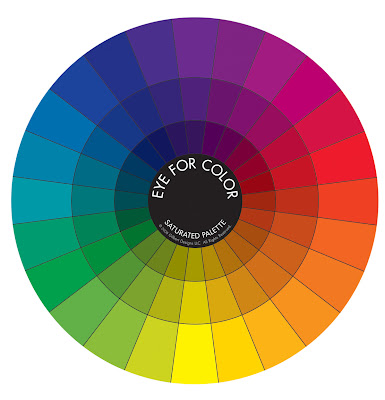
The outer ring of the Saturated Wheel is the most intense version of each of the 24 color families. The deep, rich, earthy tones of the inner rings are less saturated because each pure color of the outer ring has been diluted (with either black or it's complementary color - more on that another time). Note that as you move into the center of the saturated wheel, the colors become less saturated (less pure) and lower in value (darker).

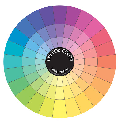
The outer ring in the Pastel Wheel depicts the same color families as in the Saturated Wheel, but white has been added - reducing the saturation (less pure) and increasing the value (lighter). As you move into the center of the wheel, the colors become even less saturated and higher in value. These unsaturated colors are peaceful and serene in comparison to the vibrancy of a saturated palette.

Have you noticed how beautifully the colors with similar saturation blend together? To see this more clearly, my girlfriend, Joie (what could I do without you?!) has isolated colors within each ring of the color wheels. These pastel colors bring to mind iced sorbet ...
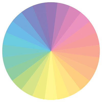
Middle ring of the EFC pastel color wheel

These low value (dark) unsaturated colors are earthy and complex and look very rich together, a true 'autumn' palette (remember Color Me Beautiful ? - see side bar):
Inner ring of the EFC saturated wheel

As you can see, colors of similar saturation look yummy together and provide another transitional element (remember from last time we chose transitions which contained bits of each color) to help pull your eye from one color to another. Sometimes large differences in saturation or value is exactly what you want to make specific elements in your design stand out. But if the colors in your composition seem to compete with each other and appear speckled, then you may need to transition between each using saturation as a bridge. Take the following pile of gems for example.


Light yellow-green (low saturation and high value) and deep violet-red (high saturation and low value) are 2 parts of a triad (we will discuss this another day) and work well together. However, the combination on the left is a little speckled because of the large differences in value and saturation.

Adding gems within the same 2 color families, but this time with comparable saturation, helps pull the 2 original colors together. The composition on the right isn't necessarily better than the first, it is just a little more harmonious because the colors flow (or transition) from one to the next.

This leads us to...

Focus on Saturation - Exercise 3
(I recommend doing:
Exercise 1 - The Value of Texture and
Exercise 2 - Color Transitions first!)


Materials:
  • old magazines that you can tear up
  • glue stick
  • sheet of paper (cardstock preferably) cut into a square
Directions:
  • Choose 2 colors - this time make sure to use highly saturated colors (pure, intense)
  • Tear out pieces of each color from the magazine
  • Glue 'blob' of one color into one corner and 'blob' of second color into opposite corner as you did in the previous exercise.
Move from one color to the other:
  • The challenge is to flow between the 2 original colors and avoid a 'speckled' appearance
  • Flip through your magazines to try to find pieces of equal saturation
  • Try 'leaning' the colors of your original piles towards the next color by matching value (darkness or lightness)
  • Check how well you transition by squinting your eyes and looking at your composition. In this manner you cut down the light entering the cones in your eyes which reduces your ability to see color and allows you to focus on light and dark (the function of the rods in your eyes)
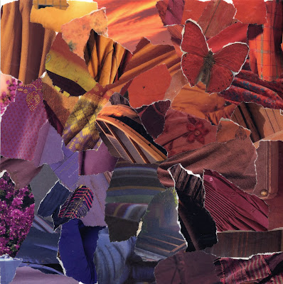
  • See the collage above for inspiration
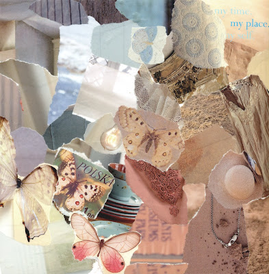
Now do the same thing with unsaturated colors. In the example below I chose high value pastel hues. I actually didn't do a very good job of transitioning without 'speckles'. Squint your eyes and you will notice a few pieces out of place from a value standpoint. However, I really liked the composition and decided to leave it as is... oh well! (I could tell you I did it on purpose to illustrate a point...)


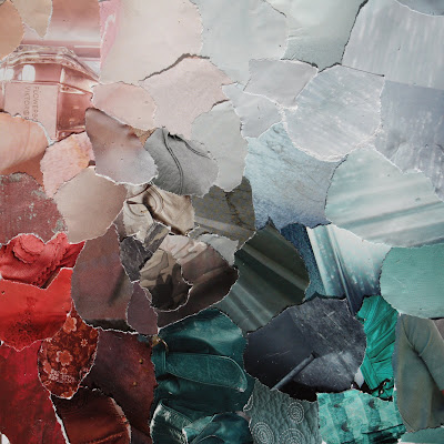
Finally - the ultimate challenge is to flow between 1 highly saturated color and an unsaturated color. I also suggest using ones far apart in value. Take a look at the piece below to see what I mean (the little dark dots are rain - I had to race outside to grab as much light as possible on this overcast day in Seattle and got the pic just before the clouds burst!).


I would love to see your compositions with paper. Thanks to those of you who have already shared your results from the previous exercises with me and on your own blogs! I would also love to see you do these same projects in your favorite mediums - photography, painting, beadwork... Let me know what you come up with!

Even though I'm a saturated kind-of gal, I was in the mood for the muted pastels of spring. Here is bouquet of stock in my kitchen.

My 8 year old son told me the violet-pink ones smell like cinnamon. Unfortunately I'm on week 7 (yes 7!!) of a nasty cold/flu bug and my nose is too stuffy to smell them...

Thursday, March 12, 2009

Color Transitions


This is part 2 of my color discussions/exercises. Come dive into color with me!

Monochromatic color schemes come alive by including different values, from bright highlights to dark shadows. There is movement in this green mosaic because green flows from yellow-green to deep green to even a bit of blue-green where the sky is reflected in the laurel leaves. Monochromatic doesn't have to mean a solid, single shade of a color (how boring!) - so much more exciting to expand it!

How many of you tried the monochromatic collage exercise from the last post? Lisa found herself questioning whether her 'reds' were 'red' enough and I say anything with a bit of reddish tinge to it is fair game! So, yes to pink and red-orange and violet-red and burgundy! I hope you made a few and tried lots of different colors. Ready to add another color?

This next exercise will help you move from one color to another by taking advantage of the variations within each monochromatic collage. To give you an idea of where we are going to go with this, I put together this mosaic to show how red and green (complementary colors!) can work well together. An effective tool to pull your eye from one color to another is to use transition pieces.

There are many different types of transitions (much more of this at a later date) but the most common type of transition from one color to another is to find pieces that include bits of each color. Note that almost all of the photographs contain both green and red (in some shade) and so your eye naturally flows from red to green.

On to the next exercise (make sure you do Exercise 1 first!):
Color Transitions - Exercise 2


Materials:
  • old magazines that you can tear up
  • glue stick
  • sheet of paper (cardstock preferably) cut into a square
Directions:
  • Choose 2 colors - easiest if they are of similar saturation (purity, intensity)
  • Tear out pieces of each color from the magazine
  • Glue 'blob' of one color into one corner and 'blob' of second color into opposite corner as shown above
Now comes the fun part:
  • The challenge is to flow between the 2 original colors
  • Flip through your magazines to try to find pieces that contain both colors OR introduce an additional color between the 2 originals such that you can find transition pieces between each set of colors.
  • Try 'leaning' the colors of your original piles towards the next color
For instance, in the example above, I found some calla lilies that moved gradually from a muddied green (green that has a bit of it's complementary color - red - in it) to orange. I also found lots of pieces that moved from green to yellow and yellow to orange. Moving from red to orange was easy - there were some orange-red bits in my original pile of red.

Try moving through a completely different color on the other side. In this case I found a fabulous green to pink petal with a green bug (lace wing?) so I went with hot pink! The deep rich pink flowed beautifully back into reds which leaned to the cool (red with a touch of blue in it) on that side.

The center can be a bit tricky and it is okay to leave it open. However, in this case I found a handblown glass vase in yellow-green with an orange flower on top and it worked as a centerpiece.

These colors can be echoed in any medium. I bought some fun fabrics in all of the colors of my collage and even found transition pieces that tied 2 colors together.


This Analogous bead soup flows from pink through red into orange (so yes, Lisa you can use them together!).


Trying out color schemes with old magazines and glue is a cheap, easy, fun and forgiving way to play with color. Use the colors you pulled together in your collage for some fun new projects!

Sunday, March 8, 2009

The 'Value' of Texture

Staging by Kiki Meyers and Photo by Diane Ahern

Nature is rarely content with solid blocks of color which is why she is so beautiful. Even within a single color, there are always dark shadows and bright highlights. Including different values in your own art work is one way to provide texture and movement and interest.

I promised to discuss value and texture and what better way to do so than by taking 'color' out of the equation. A plain sheet of white paper is rather boring. But it isn't that the 'white' is boring, it is the fact that a uniform color is stagnant, there is no movement on the page.


In the images above, our eyes are first drawn to the areas on each photo that present the greatest difference in value (lightness or darkness) such as the spot on the painted gear that has rusted through the paint, or the dark bark in the crotch of the birch tree on the far left. Our senses are further stimulated by moving from one area of high contrast to the next. Once we have absorbed the darkest darks and brightest highlights our eyes can then take in all of the other details. It is this mixture of light and dark values that provides us with visual texture.

If seen on it's own, the birch bark or the painted gear would be classed as 'white'. However when compared with the 'grey scale' underneath, you can see many different shades from white through grey and even black.


Color is introduced into these pictures, but the concept is the same. It is the value differences, the dark shadows and brighter highlights that give each photo interest. Notice too, that in my Copper Penny bead soup, I have included different shapes and sizes of beads as well as matte finishes and shiny surfaces - all of these components contribute to the texture and movement in the soup. But more on that another day.

Here is the first step in a series of easy, fast and fun exercises that I give to all of my students - from 1st through 6th graders in basic art classes up through adults in my beading and color classes - to help them understand value and at the same time stimulate their right brain. If you decide to do this series of exercises, I promise it will get more exciting later! Let me know if you are game...

Value Study - Step One

Materials:
  • a couple of old magazines that you can tear up
  • glue stick
  • sheet of paper (cardstock preferably)
  • timer
Directions:
  • set the timer for 10 minutes (yep, only 10!)
  • choose a single color at random
  • tear out pieces of that color from the magazine and randomly glue onto your cardstock
The Rules:
  • make sure you use all values of the color and it is okay to be generous with the definition of the color family (eg. 'green' could include blue-green and yellow-green)
  • glue into a 'blob' so that there is no cardstock showing through the middle of your 'blob'
  • make sure you stop at 10 minutes to prevent your left brain from taking over
It sounds so easy and it is. But I have found 1st graders to fly with it more readily than adults. Our left brains are so use to being in control that we keep trying to make the 'blob' pretty and orderly and we get frustrated at first with the short time we've been given. If you find yourself in this camp then try it again. Remember it is just paper!

I know this first exercise seems juvenile, but bear with me - we will build on it!

You may want to try the same idea in a different medium. Take out your camera and search for just one color (even if you have to eventually crop the photo to isolate it). Or throw fabric scraps from the same color family into a pile. Whatever medium you choose make sure to include all values of the color - light and dark to mimic highlights and shadows.


...we will expand on this next time