 Staging by Kiki Meyers and Photo by Diane Ahern
Nature is rarely content with solid blocks of color which is why she is so beautiful. Even within a single color, there are always dark shadows and bright highlights. Including different
values in your own art work is one way to provide texture and movement and interest.
I promised to discuss
value and
texture and what better way to do so than by taking 'color' out of the equation. A plain sheet of white paper is rather boring. But it isn't that the 'white' is boring, it is the fact that a uniform color is stagnant, there is no movement on the page.

In the images above, our eyes are first drawn to the areas on each photo that present the greatest difference in
value (lightness or darkness) such as the spot on the painted gear that has rusted through the paint, or the dark bark in the crotch of the birch tree on the far left. Our senses are further stimulated by moving from one area of high contrast to the next. Once we have absorbed the darkest darks and brightest highlights our eyes can then take in all of the other details. It is this mixture of light and dark
values that provides us with visual texture.
If seen on it's own, the birch bark or the painted gear would be classed as 'white'. However when compared with the 'grey scale' underneath, you can see many different shades from white through grey and even black.
Color is introduced into these pictures, but the concept is the same. It is the
value differences, the dark shadows and brighter highlights that give each photo interest. Notice too, that in my
Copper Penny bead soup, I have included different shapes and sizes of beads as well as matte finishes and shiny surfaces - all of these components contribute to the texture and movement in the soup. But more on that another day.
Here is the first step in a series of easy, fast and fun exercises that I give to all of my students - from 1st through 6th graders in basic art classes up through adults in my beading and color classes - to help them understand
value and at the same time stimulate their
right brain. If you decide to do this series of exercises, I promise it will get more exciting later! Let me know if you are game...
Value Study - Step One

Materials:
- a couple of old magazines that you can tear up
- glue stick
- sheet of paper (cardstock preferably)
- timer
Directions:
- set the timer for 10 minutes (yep, only 10!)
- choose a single color at random
- tear out pieces of that color from the magazine and randomly glue onto your cardstock
The Rules:
- make sure you use all values of the color and it is okay to be generous with the definition of the color family (eg. 'green' could include blue-green and yellow-green)
- glue into a 'blob' so that there is no cardstock showing through the middle of your 'blob'
- make sure you stop at 10 minutes to prevent your left brain from taking over
It sounds so easy and it is. But I have found 1st graders to fly with it more readily than adults. Our left brains are so use to being in control that we keep trying to make the 'blob' pretty and orderly and we get frustrated at first with the short time we've been given. If you find yourself in this camp then try it again. Remember it is just paper!
I know this first exercise seems juvenile, but bear with me - we will build on it!
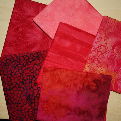
You may want to try the same idea in a different medium. Take out your camera and search for just one color (even if you have to eventually crop the photo to isolate it). Or throw fabric scraps from the same color family into a pile. Whatever medium you choose make sure to include all
values of the color - light and dark to mimic highlights and shadows.

...we will expand on this next time


