Showing posts with label teal. Show all posts

Wednesday, September 2, 2015

A Rainbow of Color


Rainbow Butterfly Shawl
For Sale on Etsy

Monday, January 12, 2015

More Flowers


'Carolyn's Flower Garden' 12"x36"
From my Gallery of Paintings

Wednesday, January 7, 2015

Color Inspiration


Color Inspiration from Purple Flower Garden
Interestingly, the color palette I used in my last painting actually includes the #ColoroftheYear: Marsala!

Would love to see what you do with this color palette!

Tuesday, January 6, 2015

Purple


Purple Flower Garden
1st painting of the year
From my Gallery of Acrylic Paintings

Monday, January 5, 2015

Things I Love


Old, weathered glass
Spending an entire day with a girlfriend
People who ignite your creativity

Wednesday, November 19, 2014

Mouse Pad


Artist's dilemma:
Excited when my paintings sell
But a bit sad too
It's sometimes hard to let them go
This one is going to a new home today... but I decided to hold on a bit longer

I'm printing up mouse pads and you can see them in my Etsy Shop

Thursday, November 13, 2014

Vibrant Color


Though I love Black and White, I just can't stay away from Color!

Here is a digital art piece I created from an original photograph.
'Radiant Iris' is available in my Etsy shop as greeting cards and prints onto metal

I'm in the process of printing one in large format for thet Overlake Senior Care Center in Bellevue. Will let you know when it is hanging!

Wednesday, October 1, 2014

In Abstract


'Glass Lake'
A painting for my Hubby

Tuesday, September 30, 2014

Abstract in Teal and Purple


Inspired by the huge paintings a dear friend and I enjoyed at the Royal Academy in London

on Etsy

Wednesday, September 24, 2014

Cottage Chic


'Apricot Tree'
A touch of whimsy in soft colors

on Etsy

Sunday, September 14, 2014

In Full Color


'Teal Sky'
Another summer painting - this one in vivid, surreal colors

In a room:


on etsy

Saturday, September 13, 2014

Painting in a Room


'Copper Age'

on etsy

Sunday, July 20, 2014

Things I Love (Day 6)


Spanish wine
Moonlight on the water
Dancing in a flowing dress


(Day 6)

Things I Love (Day 4)


Beach glass in shades of blue
Loons on the water
Lapping waves

Monday, May 19, 2014

Nuno Felt Scarf - Rainbow Stones


This one was created in a number of steps starting with a pre-felt skin in colors flowing from teal to chartreuse to orange.

On Etsy

Friday, May 16, 2014

Nuno Felt Scarf - Shade Garden


Nuno Felt Scarf in shades of chartreuse and teal.
'Shade Garden'

in my Etsy shop:

Wednesday, May 7, 2014

Wednesday, February 12, 2014

Nuno Felt Pillows


Nuno felting in the same palette of muted purple, teal and blush

Tuesday, February 11, 2014

Add a Pop of Color!


Color Inspiration - Painted Poppy Pods

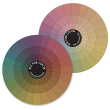
I painted this piece for a client who loves purple and teal in muted, earthy undertones.  I used various values and saturation levels, but felt I needed something more to make the palette pop. By consulting my color wheel, I realized that just a hint of cool gold would help create more movement and interest, yet still work within her color palette.

Tuesday, November 12, 2013

Step-by-Step Color Evolution

Come take a peek at how the color evolved in this abstract painting!

I've been having fun with abstract art - admiring the way colors dance and play off of each other. And marveling in the freedom to paint over, to alter the look and feel with just small dabs of paint here and there.

I often get asked how I pull colors together and my usual answer is to simply play, then figure out what is and what isn't working! On this painting, I started with a complementary palette of red-orange and blue-green geometric swatches and thought I would share the last few steps I took to pull the colors together:

 I liked the basic colors and design, but felt that the composition was spotty - the contrast between dark red-orange and light teal too great.

So I painted over some of the red with more teal, added some dark teal accents as well as some drips of rust to help pull the teal and red-orange together.

A bit of white here and there helped draw the eye in a circle around the painting.

 I felt that the colors worked better with each other, however still too much emphasis on the dominant red-orange.

So I painted over more of the red, softened the white with a bit of rust and added drip lines of teal to better link the squares and make the geometric aspect a bit more obscure.

'Copper Age'