
 Hot Scarves on my wicker chair - photo by Diane Ahern
I love red-orange (can you tell?) and often combine it with red-violet (hot pink) - they are bright and intense, but harmonious because they both contain lots of red. The scarves on my wicker chair also have a bit of yellow-orange. But notice how your eye moves easily across all the colors because red-orange and orange are present to help pull from one section of the color wheel to another.
I named the following hot analogous soup 'Tropical Punch' because it reminds me of being 8 or 9 and going to a birthday party full of bright colors, store-decorated cake and a pitcher of really sweet punch (Mom always made my cake).
 Bead Soup 'Tropical Punch'
 Analogous colors can be expanded further by working your way along the color wheel. In this next soup, I've added some violet and blue-violet. Amazing how just a touch of these cooler colors adds depth to the soup.
 Bead Soup 'Sunrise'
 Bead Soup 'North Light'
 It is similar to 'Sunrise', with different proportions and a little more blue. The color relationship can be characterized as an expanded analogous or two parts of the triad pictured here.
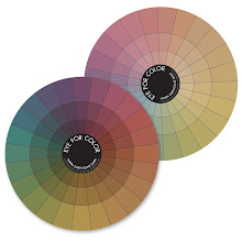
Thanks to my dear friend Joie Moring of MoringDesign for compiling the colorwheel art work for me!


Your jewelry is gorgeous! I love your colours too. Thanks for your comment on my blog.
ReplyDeleteyou are a wonderful teacher!!
ReplyDelete