Monday, March 16, 2009

Are you Saturated?

'Vietnamese Boats' - unknown

This is part 3 of (well actually I don't know how many) color discussions/exercises. Would love for you to dive into color with me!

Saturation
is the purity, intensity, brightness of a color. Saturated colors feel alive and I am drawn to them. This oil painting by an unknown Vietnamese artist hangs in my deep gold living room and draws me into the saturated blues of water and evening sky. The dilapidated buildings pulse with intense yellows and a bit of orange-red.

The same color palette is used below - but what a difference! The muted colors in Susan Reynold Leonardt's drawing are echoed in the bouquet of flowers, the tea cup and even the shortbread biscuit. This unsaturated palette is peaceful and serene in comparison to the vibrancy of the oil painting. (By the way, Susan is my neighbor and very good friend who agreed to draw this and other pictures for the Inspirations spread in EYE FOR COLOR.)


Vignette from Eye For Color - drawing by Susan Reynold Leonhardt

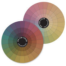
Saturation is a powerful tool in your composition. To understand it more fully, take a look at the color wheels below. These saturated and pastel color wheels are from EYE FOR COLOR.

The outer ring of the Saturated Wheel is the most intense version of each of the 24 color families. The deep, rich, earthy tones of the inner rings are less saturated because each pure color of the outer ring has been diluted (with either black or it's complementary color - more on that another time). Note that as you move into the center of the saturated wheel, the colors become less saturated (less pure) and lower in value (darker).

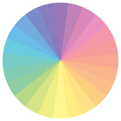
The outer ring in the Pastel Wheel depicts the same color families as in the Saturated Wheel, but white has been added - reducing the saturation (less pure) and increasing the value (lighter). As you move into the center of the wheel, the colors become even less saturated and higher in value. These unsaturated colors are peaceful and serene in comparison to the vibrancy of a saturated palette.

Have you noticed how beautifully the colors with similar saturation blend together? To see this more clearly, my girlfriend, Joie (what could I do without you?!) has isolated colors within each ring of the color wheels. These pastel colors bring to mind iced sorbet ...Middle ring of the EFC pastel color wheel
These low value (dark) unsaturated colors are earthy and complex and look very rich together, a true 'autumn' palette (remember Color Me Beautiful ? - see side bar):
Inner ring of the EFC saturated wheel

As you can see, colors of similar saturation look yummy together and provide another transitional element (remember from last time we chose transitions which contained bits of each color) to help pull your eye from one color to another. Sometimes large differences in saturation or value is exactly what you want to make specific elements in your design stand out. But if the colors in your composition seem to compete with each other and appear speckled, then you may need to transition between each using saturation as a bridge. Take the following pile of gems for example.


Light yellow-green (low saturation and high value) and deep violet-red (high saturation and low value) are 2 parts of a triad (we will discuss this another day) and work well together. However, the combination on the left is a little speckled because of the large differences in value and saturation.

Adding gems within the same 2 color families, but this time with comparable saturation, helps pull the 2 original colors together. The composition on the right isn't necessarily better than the first, it is just a little more harmonious because the colors flow (or transition) from one to the next.

This leads us to...

Focus on Saturation - Exercise 3
(I recommend doing:
Exercise 1 - The Value of Texture and
Exercise 2 - Color Transitions first!)

Materials:
  • old magazines that you can tear up
  • glue stick
  • sheet of paper (cardstock preferably) cut into a square
Directions:
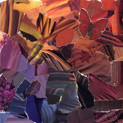
  • Choose 2 colors - this time make sure to use highly saturated colors (pure, intense)
  • Tear out pieces of each color from the magazine
  • Glue 'blob' of one color into one corner and 'blob' of second color into opposite corner as you did in the previous exercise.
Move from one color to the other:
  • The challenge is to flow between the 2 original colors and avoid a 'speckled' appearance
  • Flip through your magazines to try to find pieces of equal saturation
  • Try 'leaning' the colors of your original piles towards the next color by matching value (darkness or lightness)
  • Check how well you transition by squinting your eyes and looking at your composition. In this manner you cut down the light entering the cones in your eyes which reduces your ability to see color and allows you to focus on light and dark (the function of the rods in your eyes)
  • See the collage above for inspiration
Now do the same thing with unsaturated colors. In the example below I chose high value pastel hues. I actually didn't do a very good job of transitioning without 'speckles'. Squint your eyes and you will notice a few pieces out of place from a value standpoint. However, I really liked the composition and decided to leave it as is... oh well! (I could tell you I did it on purpose to illustrate a point...)


Finally - the ultimate challenge is to flow between 1 highly saturated color and an unsaturated color. I also suggest using ones far apart in value. Take a look at the piece below to see what I mean (the little dark dots are rain - I had to race outside to grab as much light as possible on this overcast day in Seattle and got the pic just before the clouds burst!).


I would love to see your compositions with paper. Thanks to those of you who have already shared your results from the previous exercises with me and on your own blogs! I would also love to see you do these same projects in your favorite mediums - photography, painting, beadwork... Let me know what you come up with!

Even though I'm a saturated kind-of gal, I was in the mood for the muted pastels of spring. Here is bouquet of stock in my kitchen.

My 8 year old son told me the violet-pink ones smell like cinnamon. Unfortunately I'm on week 7 (yes 7!!) of a nasty cold/flu bug and my nose is too stuffy to smell them...

Thursday, March 12, 2009

Color Transitions


This is part 2 of my color discussions/exercises. Come dive into color with me!

Monochromatic color schemes come alive by including different values, from bright highlights to dark shadows. There is movement in this green mosaic because green flows from yellow-green to deep green to even a bit of blue-green where the sky is reflected in the laurel leaves. Monochromatic doesn't have to mean a solid, single shade of a color (how boring!) - so much more exciting to expand it!

How many of you tried the monochromatic collage exercise from the last post? Lisa found herself questioning whether her 'reds' were 'red' enough and I say anything with a bit of reddish tinge to it is fair game! So, yes to pink and red-orange and violet-red and burgundy! I hope you made a few and tried lots of different colors. Ready to add another color?

This next exercise will help you move from one color to another by taking advantage of the variations within each monochromatic collage. To give you an idea of where we are going to go with this, I put together this mosaic to show how red and green (complementary colors!) can work well together. An effective tool to pull your eye from one color to another is to use transition pieces.

There are many different types of transitions (much more of this at a later date) but the most common type of transition from one color to another is to find pieces that include bits of each color. Note that almost all of the photographs contain both green and red (in some shade) and so your eye naturally flows from red to green.

On to the next exercise (make sure you do Exercise 1 first!):
Color Transitions - Exercise 2


Materials:
  • old magazines that you can tear up
  • glue stick
  • sheet of paper (cardstock preferably) cut into a square
Directions:
  • Choose 2 colors - easiest if they are of similar saturation (purity, intensity)
  • Tear out pieces of each color from the magazine
  • Glue 'blob' of one color into one corner and 'blob' of second color into opposite corner as shown above
Now comes the fun part:
  • The challenge is to flow between the 2 original colors
  • Flip through your magazines to try to find pieces that contain both colors OR introduce an additional color between the 2 originals such that you can find transition pieces between each set of colors.
  • Try 'leaning' the colors of your original piles towards the next color
For instance, in the example above, I found some calla lilies that moved gradually from a muddied green (green that has a bit of it's complementary color - red - in it) to orange. I also found lots of pieces that moved from green to yellow and yellow to orange. Moving from red to orange was easy - there were some orange-red bits in my original pile of red.

Try moving through a completely different color on the other side. In this case I found a fabulous green to pink petal with a green bug (lace wing?) so I went with hot pink! The deep rich pink flowed beautifully back into reds which leaned to the cool (red with a touch of blue in it) on that side.

The center can be a bit tricky and it is okay to leave it open. However, in this case I found a handblown glass vase in yellow-green with an orange flower on top and it worked as a centerpiece.

These colors can be echoed in any medium. I bought some fun fabrics in all of the colors of my collage and even found transition pieces that tied 2 colors together.


This Analogous bead soup flows from pink through red into orange (so yes, Lisa you can use them together!).


Trying out color schemes with old magazines and glue is a cheap, easy, fun and forgiving way to play with color. Use the colors you pulled together in your collage for some fun new projects!

Sunday, March 8, 2009

The 'Value' of Texture

Staging by Kiki Meyers and Photo by Diane Ahern

Nature is rarely content with solid blocks of color which is why she is so beautiful. Even within a single color, there are always dark shadows and bright highlights. Including different values in your own art work is one way to provide texture and movement and interest.

I promised to discuss value and texture and what better way to do so than by taking 'color' out of the equation. A plain sheet of white paper is rather boring. But it isn't that the 'white' is boring, it is the fact that a uniform color is stagnant, there is no movement on the page.


In the images above, our eyes are first drawn to the areas on each photo that present the greatest difference in value (lightness or darkness) such as the spot on the painted gear that has rusted through the paint, or the dark bark in the crotch of the birch tree on the far left. Our senses are further stimulated by moving from one area of high contrast to the next. Once we have absorbed the darkest darks and brightest highlights our eyes can then take in all of the other details. It is this mixture of light and dark values that provides us with visual texture.

If seen on it's own, the birch bark or the painted gear would be classed as 'white'. However when compared with the 'grey scale' underneath, you can see many different shades from white through grey and even black.


Color is introduced into these pictures, but the concept is the same. It is the value differences, the dark shadows and brighter highlights that give each photo interest. Notice too, that in my Copper Penny bead soup, I have included different shapes and sizes of beads as well as matte finishes and shiny surfaces - all of these components contribute to the texture and movement in the soup. But more on that another day.

Here is the first step in a series of easy, fast and fun exercises that I give to all of my students - from 1st through 6th graders in basic art classes up through adults in my beading and color classes - to help them understand value and at the same time stimulate their right brain. If you decide to do this series of exercises, I promise it will get more exciting later! Let me know if you are game...

Value Study - Step One

Materials:
  • a couple of old magazines that you can tear up
  • glue stick
  • sheet of paper (cardstock preferably)
  • timer
Directions:
  • set the timer for 10 minutes (yep, only 10!)
  • choose a single color at random
  • tear out pieces of that color from the magazine and randomly glue onto your cardstock
The Rules:
  • make sure you use all values of the color and it is okay to be generous with the definition of the color family (eg. 'green' could include blue-green and yellow-green)
  • glue into a 'blob' so that there is no cardstock showing through the middle of your 'blob'
  • make sure you stop at 10 minutes to prevent your left brain from taking over
It sounds so easy and it is. But I have found 1st graders to fly with it more readily than adults. Our left brains are so use to being in control that we keep trying to make the 'blob' pretty and orderly and we get frustrated at first with the short time we've been given. If you find yourself in this camp then try it again. Remember it is just paper!

I know this first exercise seems juvenile, but bear with me - we will build on it!

You may want to try the same idea in a different medium. Take out your camera and search for just one color (even if you have to eventually crop the photo to isolate it). Or throw fabric scraps from the same color family into a pile. Whatever medium you choose make sure to include all values of the color - light and dark to mimic highlights and shadows.


...we will expand on this next time

Friday, March 6, 2009

I'm Humbled and Inspired

Sunrise in Gig Harbor, Washington (off my parent's deck!) 11/08

I am humbled by all of your comments and inspired by the art that you create. Thank you for making me feel so warm and fuzzy! When I posted my ‘give away’ I was expecting a total of 5 to 10 comments - more on the lines of: “I want beads, I want beads. Pick me, pick me!” (and that from my editor, Tonia who already has a begillion of my soups - thanks for the giggle Tonia!) and have been overwhelmed and carried away by such a huge response and all of your kind words both on my blog and via e-mail from my web site – some comments brought tears to my eyes, others made me laugh.

We all need affirmation from time to time, don’t we? So this post is about all of you – take a moment to click on the other people who commented or are following my blog and see what they are up to. You will be amazed. And inspired as I am by the creativity and talent out there in the world!

For instance, 'Dance of a Painted Lady' has inspired me this week - to focus on shape. Take a peek at Kendalee's photographic mosaics and notice her repetitive use of diamonds from the leaded glass in the church window to the tree branches and broken rocks at the base of the wall.

Hmmm, shape - pretty novel for a color girl! So I went for a walk yesterday (with my dear friend Joie) armed with my new camera. Then came home, cropped madly and took a baby step towards learning Kendalee's art form – what a blast! Here is what I came up with:

'A walk in Fremont' 3/5/09

Speaking of Kendalee - she posted a question to herself yesterday:
"I've been wondering recently about whether I'm naturally more inclined to radiate or to reflect"

She mused:
"Not everyone is designed to be the source of powerful illumination, lighting the way clearly for themselves and those who are drawn to their radiance. But reflecting is a good way to spread light too, isn't it? Perhaps with a softer, subtler glow, which sometimes has to be looked for more carefully to be noticed, but is still beautiful and inspirational in its own way."

I think we all reflect and radiate – we may just not realize it. We influence and are influenced by each person we come in contact with – sometimes in obvious ways as from a teacher, a parent, a big, sparkling personality; and at other times in ways that are so subtle it’s hard to put a finger on what we have taken away from our experience with another, but we know we are a better person for it.

I think about how many times someone has sparked my flame, or made me feel good, or contributed to my growth as an artist, a person a mother. But do I tell them? Most of the time – no. It doesn’t occur to me to do so. I become focused on my own life and projects and forget how important it is to let others know their radiance. Good thoughts, good words from others help release the flame in each of us. So thank you – I have grown this week under the glow of your words.

And now I encourage you to click on at least 5 names amongst my special readers and followers and list of blogs I follow - if they have a website or blog take a peek at their work. While you are feasting your eyes, being inspired and feeling renewed, leave some wonderful comments along the way. You will light up their day and help the artist in each to glow and radiate.

Now that I’ve made you read to the bottom (hee hee) to find out who won the bead soup 'give away', may I have a drum roll please?...

My son randomly chose a number ("But why? Mom") and the winner is Linda Stokes! Since she is also a 'follower' of my blog – she gets to choose 2 bead soups from my bead soup collection. Linda, please contact me to tell me which soups you would like and your address!

I wish I could send out soups to all of you in thanks for how wonderful you have made me feel. So...
... stay tuned, I’ll do it again!

A special thank you to Cyndi Lavin who did a wonderful Artist Profile of me in Jewelry & Beading this week!

And I've been given some homework! Lisa Reese has asked me to discuss 'texture' and how it pertains to color, color selections and it's use in my design work and bead soups. I will do so in future as well as more discussions of color and how to use color wheels.

'Lost in Green and Copper' 3/5/09

Now I'm hooked on making photo mosaics. These are (mostly) from my walk yesterday. No, there weren’t any beads on the sidewalk – I cheated just a little!

Oh, and Joie Moring refined the grids in my mosaics using Photoshop - you're simply 'mauve-olous' my friend!

Tuesday, March 3, 2009

Bead Soup GIVE-AWAY!


Samples from my Bead Soup Collection

To mark my 2nd month of blogging* and to thank all of you who have commented on my blog either directly or via e-mails through my website:

I'm celebrating by giving away 1 bead soup from my Bead Soup Collection to a special reader!

To enter to win a bead soup of your choice, simply enter a comment. The winner will be chosen in a highly technical manner: I will ask my family to choose a number - that comment number will win!

And while I'm at it, here is a Double Bonus! If your name is chosen and you happen to be a 'follower' of my blog, then you can choose 2 bead soups!


My bead soups have been used in everything from beadwork (of course!) to quilting and felting embellishment, collages and encaustic to a customer who displays them in dishes around her home. Are the creative juices flowing?!

Samples from my Bead Soup Collection

You can see more of my Bead Soup Collection on my website - they are now for sale on-line.


*On New Year's Eve a dear friend convinced me I had to 'get with the times' and start blogging. Okay... sounds good, but to be honest, I was very nervous. What would I write about, would anyone read it? How personal should it be - would I feel vulnerable? Was it hard to set up? How would I find the time to create a blog between writing a new book, teaching classes, raising kids, making kits and working on new class ideas for next year?

Well, the set up took all of 30 minutes (most of that time was in deciding which format to go with) and half way through my first entry I came to the conclusion that my blog will serve 2 purposes:
1. It is for me - a diary, a forum for expression, a way to document what is going on in my life and how my family, my art work, mother nature, food etc. is all tied to who I am; and
2. It is for you - hopefully giving you ideas, inspiration, and ultimately confidence in your artistic voice.

So sometimes my blog is personal, sometimes not. Sometimes I may strike a cord with my readers, and sometimes not. And that is okay. Because along the way, I am learning to write. I am growing with my blog.

... of course I could always use more time! But who couldn't?

Added on 3/17/09: I am still getting some wonderful comments! However, the bead soup give-away was given away (check the next post for the winner). Stay tuned, there will be another!

Sunday, March 1, 2009

Work in Progress


Unfinished Project - Freeform Peyote and Netting

I am driven by color - nuances within a single hue, different colors blended together and how they vibrate when placed side by side. This is the main reason I was drawn to seed beads in the first place. They are a glorious medium for creating 3 dimensional color harmony.


Bead Soup Collection (clockwise from top) - Dark Chocolate, Paprika, Burnt Orange, Deep Teal, Grass is Always Greener

Most of my projects start out as piles of bead soups on my work table - so I can see how the colors play against each other. I consult my color wheel, move piles around, add and subtract until I come up with a starting point for my beadweaving.


And here is the other reason I love seed bead soups - they are meant for freeform work. Letting my right brain play, not really knowing where I will end up. Freeform work is faster and so much more fun for me than structured beadweaving. In some part because the piece ends up so different from where it started as if it is a living thing.

I started this project a year ago, but had to set it aside to write books and teach classes. This tadpole was as far as I got and it sat in the corner of my work table surrounded by bead soups. Where would it take me?


I suppose that if I would have completed this piece a year ago, it may have taken me in an entirely new direction. But when I picked it up again a few weeks ago, I decided to wrap the tail in on itself and keep building up the base.

I'm not sure how long this piece will be and need to fill in the chocolate brown, but I can always add on later.


I decided it was time to throw in the teal - a stunning complement to the oranges and reds in my base. I couldn't resist this turquoise doughnut, but it has since proven to be difficult to work with because of it's rigidity.

Lots more to build up!


I am still not finished, but the piece is starting to take shape. Who knows where it will lead me?
(and I need to invest in some camera lighting and various backgrounds for photographing this piece - the vibrancy is lost in the camera's attempt to even out the values - would love some advice!)


Friday, February 27, 2009

When Given Snow...


We woke up to 3 inches of snow - very unusual for the Puget Sound especially in late February.
School was delayed 2 hours and I say When Given Snow...


... make snowballs, and snow angels and sledding tracks, and snowmen. Drink hot chocolate loaded with marshmallows (try Theo's chipotle spiced sipping chocolate!) and make some chunky vegetable soup. If you don't have a recipe, here is a quick, easy, healthy and tasty recipe from my very good friend, Mariangela.


Mariangela's Veggie Soup

Use whatever veggies you have on hand:
  • Potatoes
  • Onions
  • Kale
  • Carrots
  • Celery
  • Zuccini
Chop into small bite-size pieces and saute in olive oil and garlic until onions are soft and potatoes are slightly browned.
Cover with tomato sauce (I used what I had in my pantry - Organic Chunky Tomato Sauce + Stewed Italian Tomatoes + Tomato juice)
Simmer on Med-low heat for 30 minutes until potatoes are soft
Add salt and pepper to taste. Can also add any herbs or spices you want...

We will have left-over soup tonight and I think I will try for a 'mole' influence by adding chili powder, cumin, coriander, cinnamon and a bit of unsweeetened chocolate. Mmmm


When given snow...
...enjoy!